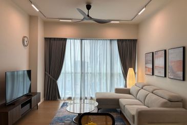
“I want to make my property look good, you know, like in those home interior magazines or like a developer’s show house. How ah?”
Where does one start? Most people would begin with basic furniture — chairs, tables, beds. Fair enough, but whether that would turn your home from ugly duckling to swan is uncertain.

Property makeover company The Makeover Guys Sdn Bhd believes in keeping it simple with these few tips that could turn your abode from “meh” to “wow”: inexpensively.
Walls
The ideal place to start with is the walls. “It is the biggest space that meets the eye and is so often neglected,” managing partner of The Makeover Guys Gavin Liew tells EdgeProp.my.
He suggests using eye-catching wallpapers to fill in the empty spaces and taking time to choose appropriate patterns that make a space look inviting. “You may also want to get creative and combine wallpaper with paint, dividing the wall into portions of painted and wallpapered patterns.”
Textured paint can be an option as well. Although it costs more than regular paint, it provides character and depth to the space. “We often use it for TV walls in the living room for a cosy effect,” notes Liew.
Homeowners could also take cues from hotel rooms. “[Hotels] often fill up the lower walls with simple 3D-like design — this is called wainscoting, and the most common form used is the bead-board variety. This, along with paint and/or wallpaper, provides immediate texture and depth, thereby raising the perceived value of your property.”
Apart from the walls, the ceiling area should not be left bare. It can be filled with Venetian plaster or wood-panels.

Curtains
After the wall, on to the curtains. Curtains play a prominent role in making a space look grand, and should work in tandem with the colours of the room.
“Fitting curtains are easy, but there are things to avoid when it comes to choosing the right ones,” warns Liew.
“Avoid floral, glossy, or shiny materials, and absolutely no ‘mini-skirts’ — all these give off a ‘cheap’ look. ‘Mini-skirts’ are curtains that partially cover windows and do not extend all the way to the floor. For this reason, they look incomplete and are rather off-putting.
“Don’t get us wrong, highly skilled professionals can easily pull off mini-skirts or florals according to their expertise, but keeping things simple is always your best bet,” adds Liew.
That being said, curtains should always be full-length (floor to ceiling). Besides, full height curtains do not require expensive railings.
“Just a simple rail with a solid, full-height, non-glossy curtain lends the room immediate grandeur,” says Liew.

Colours
It is advisable to limit the use of colours. The golden ratio, as Liew calls it, is to fill a space with 60% of a primary colour, 30% secondary colour, and 10% highlight.
What does that mean? It means that for any colour scheme, limit colour usage to a maximum of three colours.
“Let’s say white is the primary colour, wood is the secondary colour, and black is the highlight. The use of a highlight breaks the predictability of a space while subtly enhancing it. [Using] only one or two colours can get boring, but a simple addition of the highlight makes a space look just right,” recommends Liew.
Another example would be grey (primary), wood (secondary) with black highlights.

Space utilisation
Less is more — in this context quite literally — less stuff, more space.
Liew advises homeowners to place essential furniture first and work their way towards decorative add-ons.
“To get started, ask yourself; what makes a living room, a living room? A sofa, TV and TV cabinets. Next, based on need and available budget, you can add items such as extra lighting, carpets and rugs, plants, candles, and throw pillows.
“Once you figure out the placement of the main furniture, it is easier to work towards the non-essential stuff. Bedroom? Make sure there is a bed and wardrobe before all else. Bear in mind, when we say non-essentials, we mean it, although we think they are [still] super essential to make a space look good,” adds Liew.

Decorations
Decorations can be inexpensive and they add a personal touch to your home.
“If one examines good-looking interiors, there is usually a photo frame on the table, throw pillow on the sofa, a bookshelf, and decorative plants here and there.
“All these items enhance the cosiness and liveability of a space, which is what good interior design strives to achieve. Soft touches can add depth of character to living space at relatively low cost compared with other means of interior design,” says Liew.
Therefore, spend a little time and effort to decorate your property and watch it transform into a handsome and welcoming home.
Lights
Lighting is not to be taken lightly. One important thing when it comes to lights is to never use white light.
“It’s a house, not a clinic or hospital. Always go with warm white,” stresses Liew.
Lighting plays a very big part in setting the ambience of any space, both interior and exterior. Getting this right is crucial as it has the ability to alter perceptions of a property’s spaciousness, vibe (tranquillity) and style.
Once again, Liew recommends taking design cues from five-star hotels where the light is always warm and never too bright.
“Believe it or not, you can use inexpensive lights such as T5 fluorescent tube lights without compromising your property’s look. What matters is how they are utilised. In the image below, the T5 light gives off a warm glow against the wallpaper on the upper walls, creating a calming effect,” offers Liew.

He adds: “Also aim to always have at least one set of feature lighting as part of the design, preferably in the dining room which is the most prominent area of a living space. Feature lighting changes the composure of a house, making it look more elegant — you’ll find the same effect in how lighting beautifies most gardens.”
Feature lighting is generally used to enhance large living areas such as the dining room or (rarely) the living room.
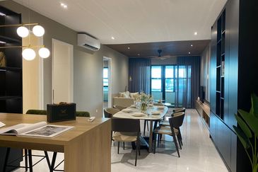
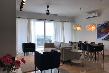
“The dining room is best (for feature lighting) because the lights can hang down to eye-level over a table, which creates a lot of impact and immediately draws your eye towards it,” says Liew, noting that there will be no need for expensive bulbs and fixtures if the hanging is right — just simple bulbs will do the trick.
When it comes to ambient lighting, there’s a big difference between spot lights and flood lights. Spot lights would be those that focus lighting to a particular spot, while flood lights would be something such as a fluorescent tube which projects light in all directions.
“Our favourite way to create the spotlight effect is to use track lighting. Track lights don’t need a plaster ceiling to hack light points, you simply use a track and keep it neat.
“We don’t encourage plaster ceilings as they require an elaborate process to hack the light points and to restore them again. And you may have to repaint certain areas and that adds to the costs,” adds Liew.
This story first appeared in the EdgeProp.my pullout on July 5, 2019. You can access back issues here.
TOP PICKS BY EDGEPROP
Taman Taming Indah 2
Bandar Sungai Long, Selangor
Telok Panglima Garang Industrial Zone
Telok Panglima Garang, Selangor


